Optique Potts Point
This was the second time that the Client, Architect and Lighting Designer had collaborated on a new optometrist shop. The Client wanted to create another successful retail space that would be a beautiful backdrop for the exquisitely crafted and exclusive eyewear.
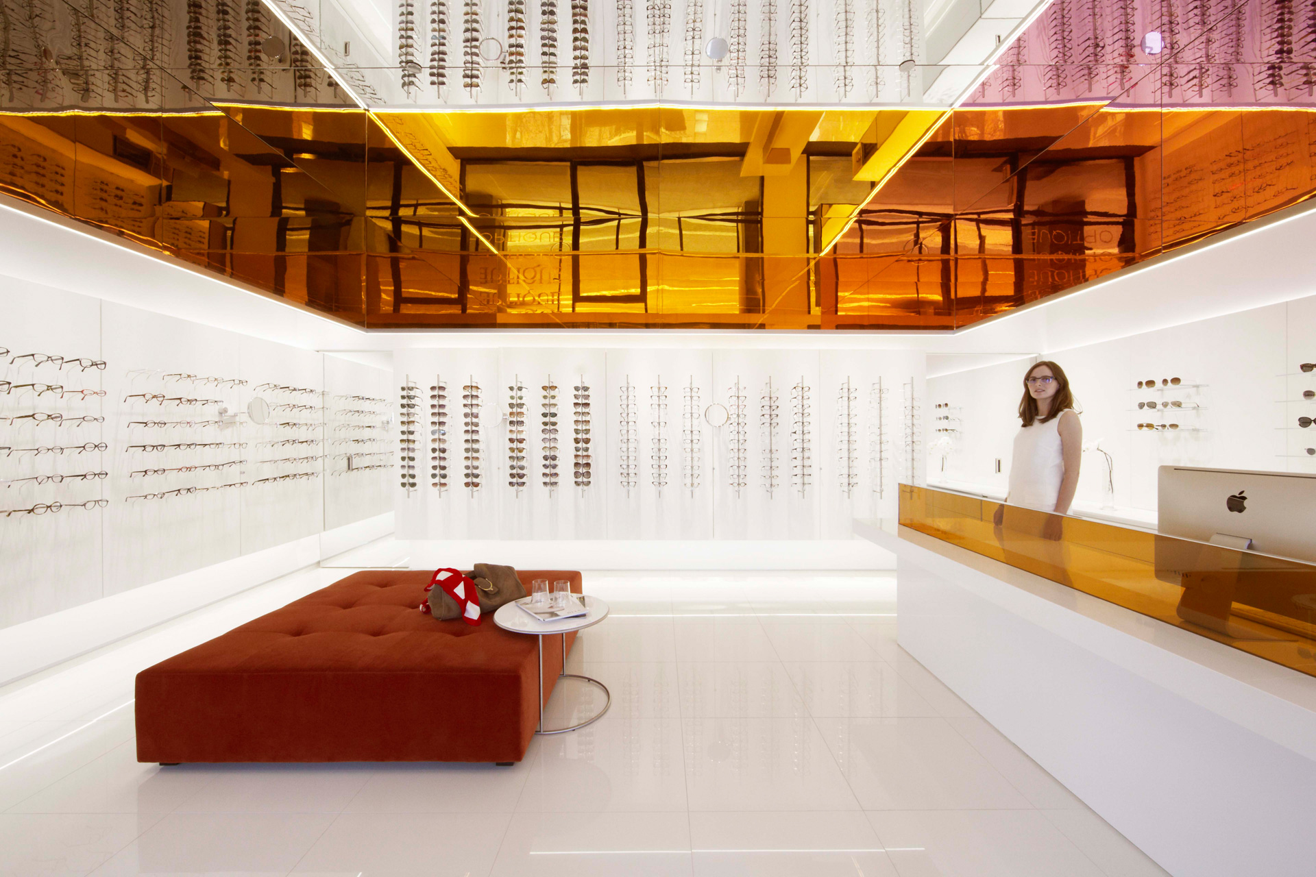
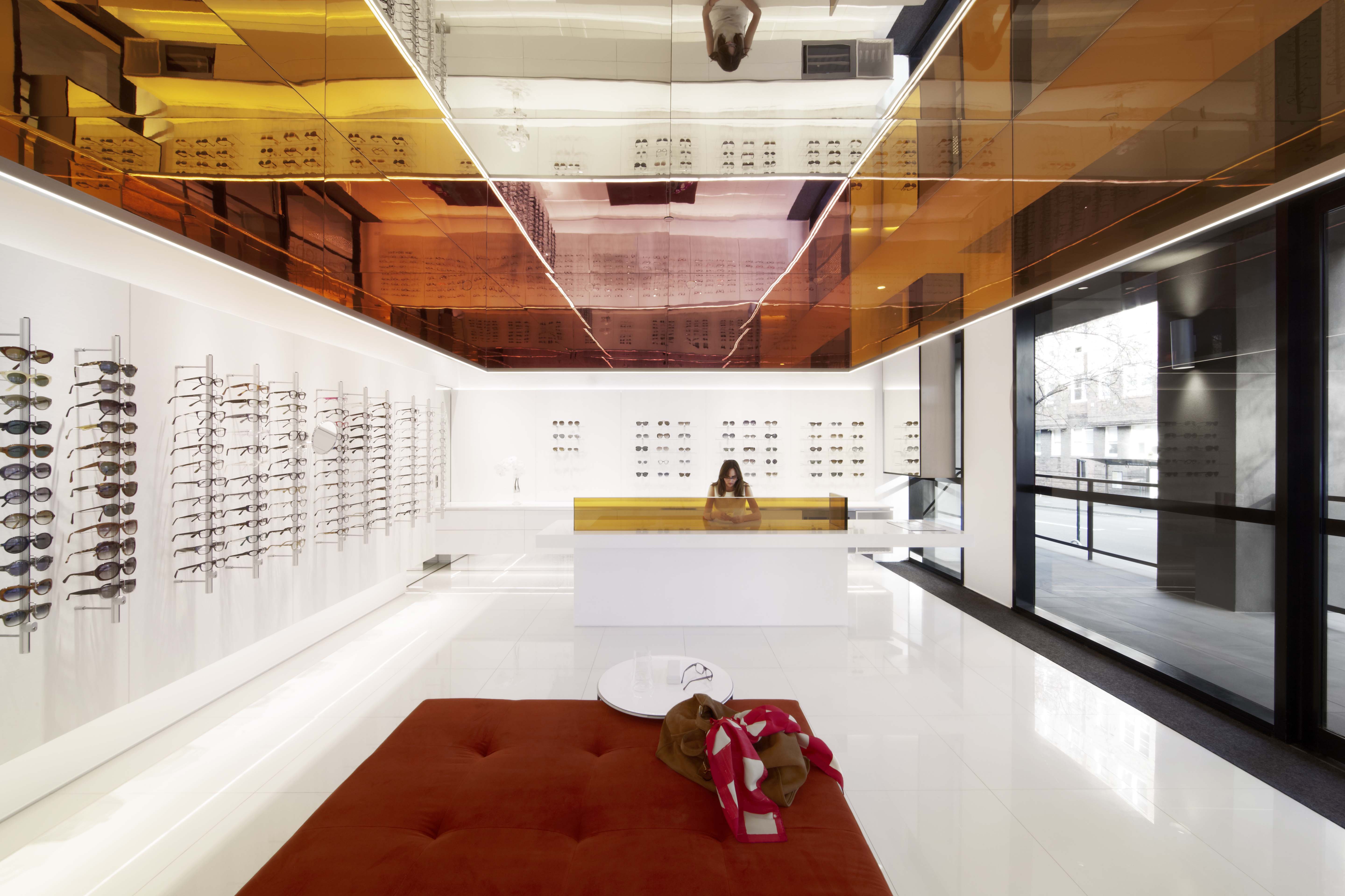
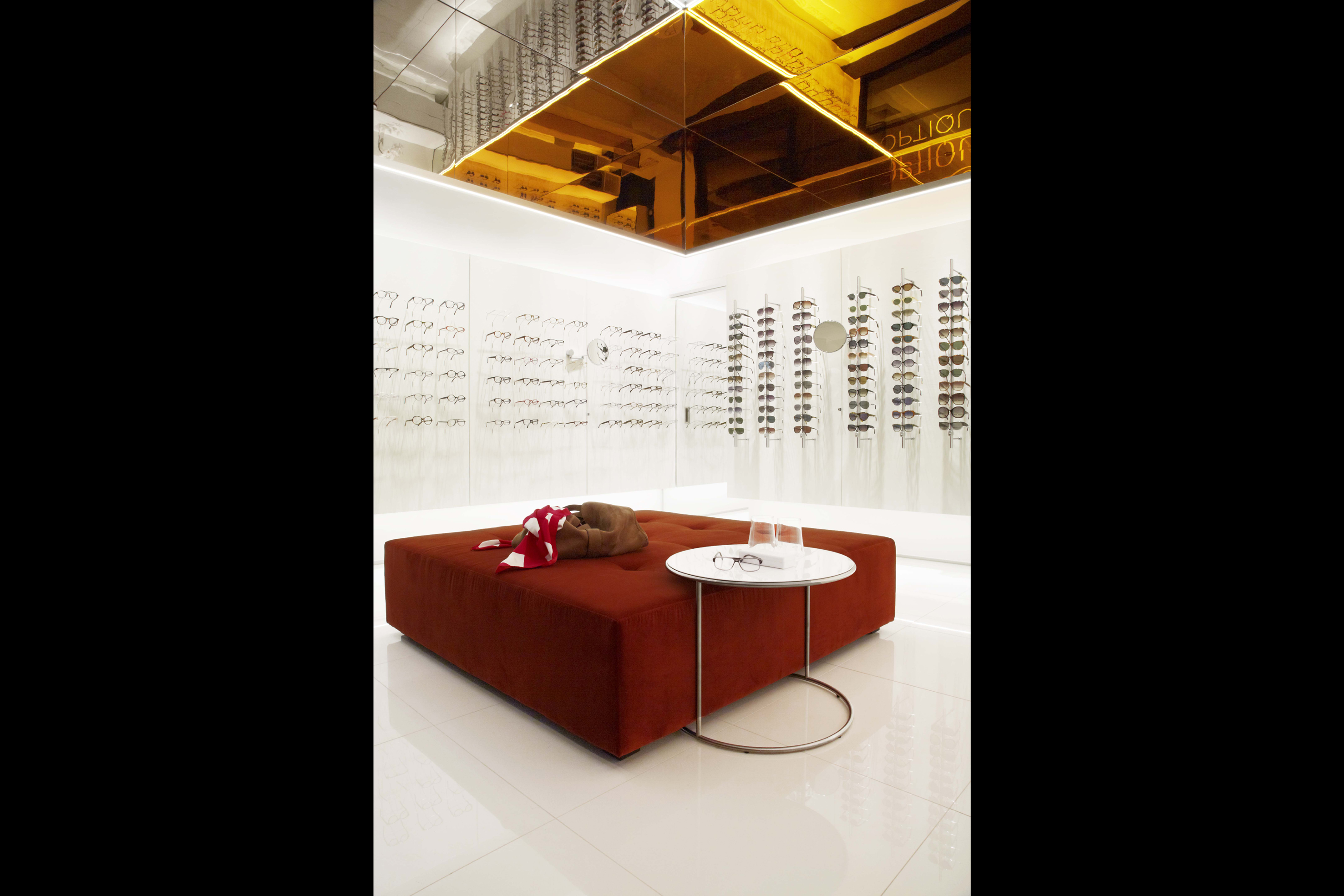
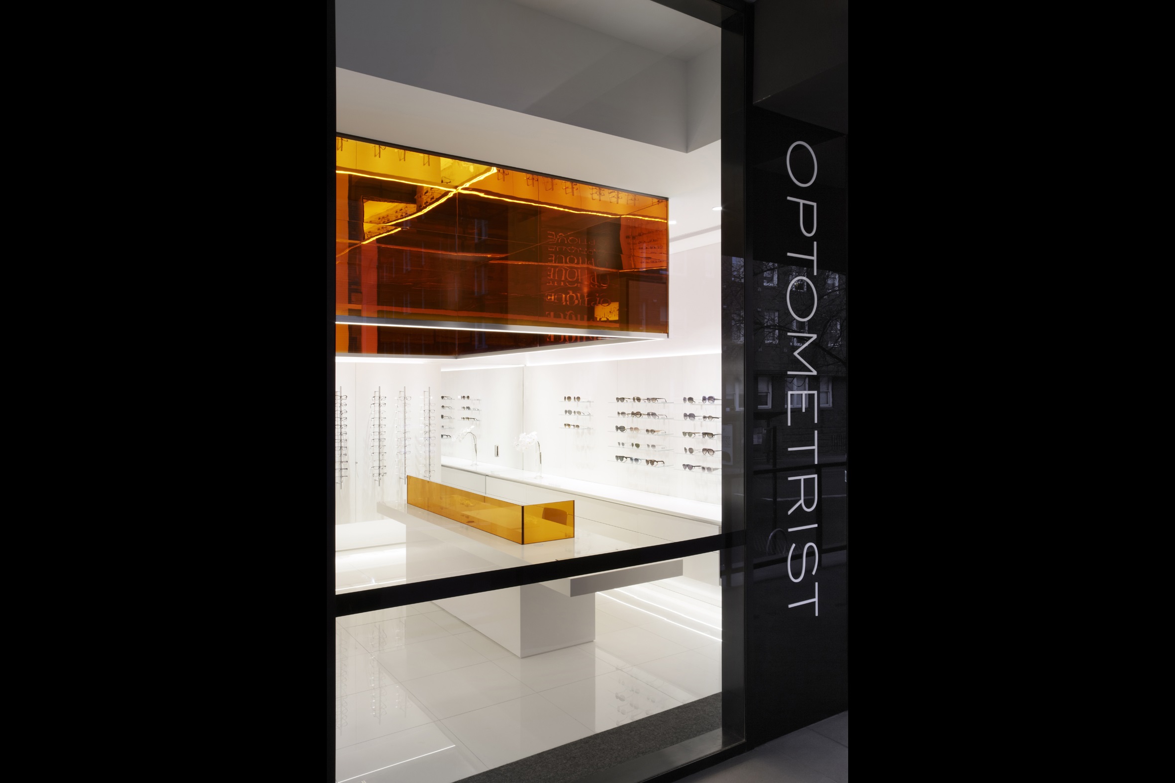
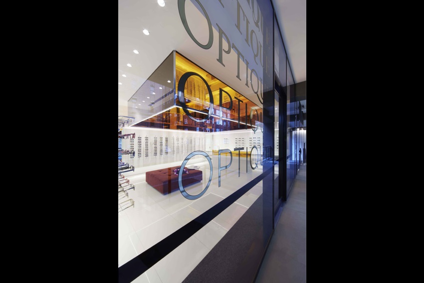
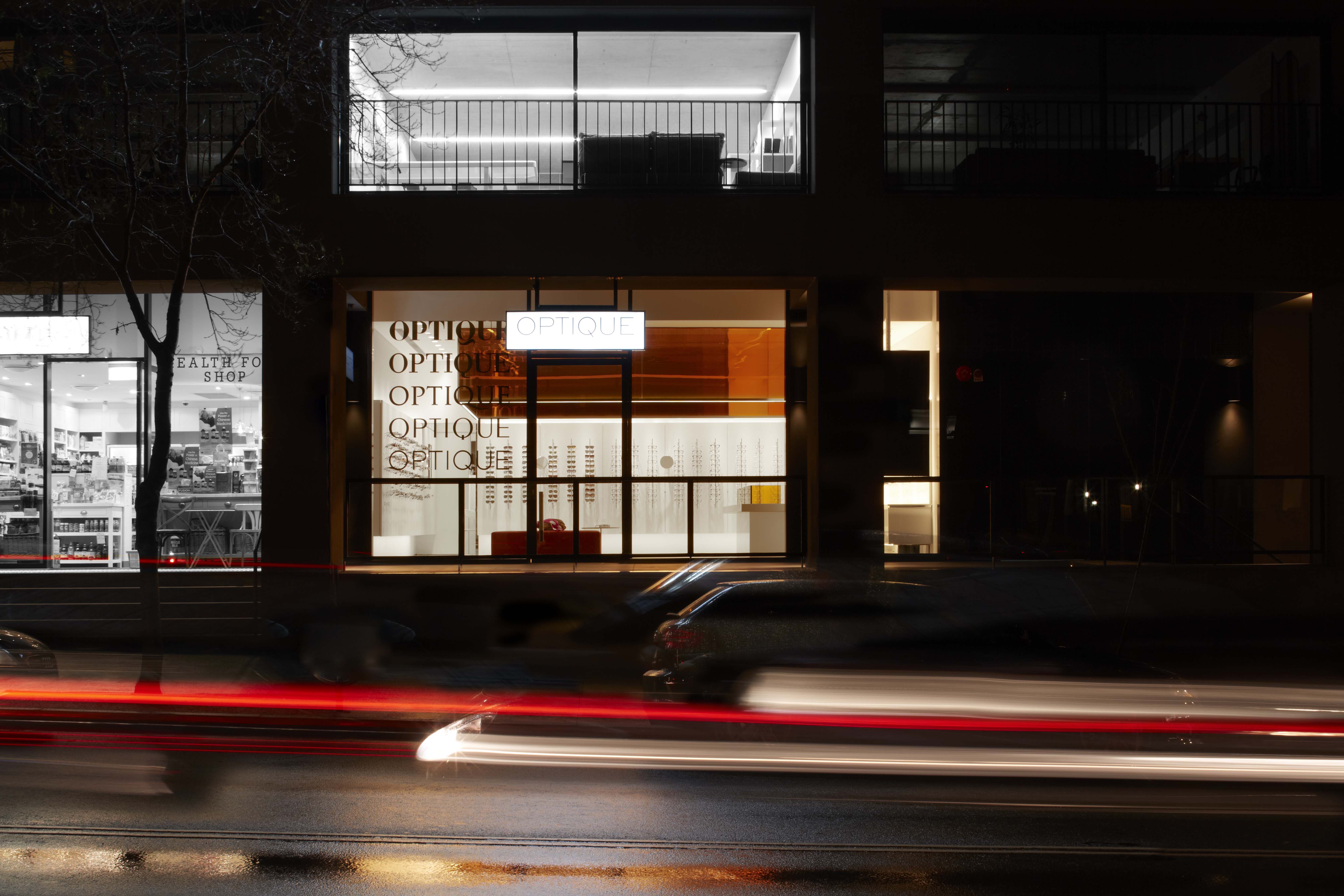
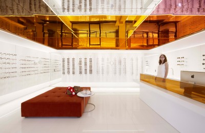
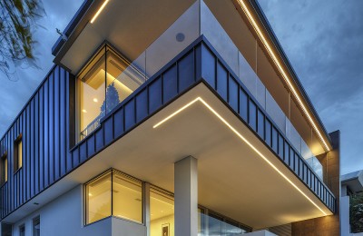
The Architect’s concept was to create a brilliant “jewelry box” at the foot of what is a dark and imposing building, to visually attract the passing pedestrian traffic. The Lighting Designer’s challenge was to illuminate a space dominated by a multi-coloured mirror ceiling feature; that did not allow for any ceiling mounted or recessed fittings.
The lighting concept was driven directly by the needs of the project:
- Attract customers to the space.
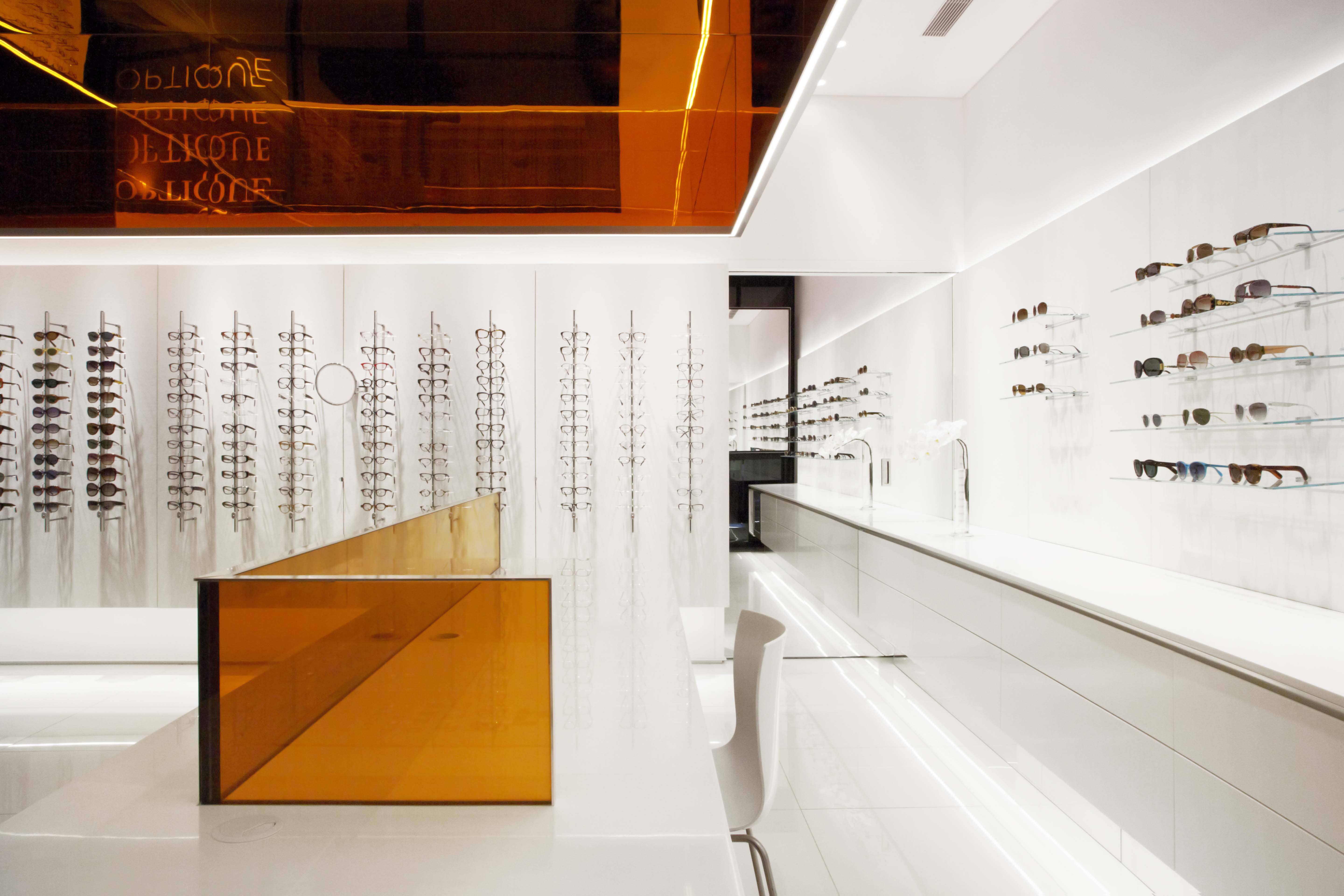
- Highlight the merchandise on the 3 display walls.
- Make customers look and feel good when they try the product.
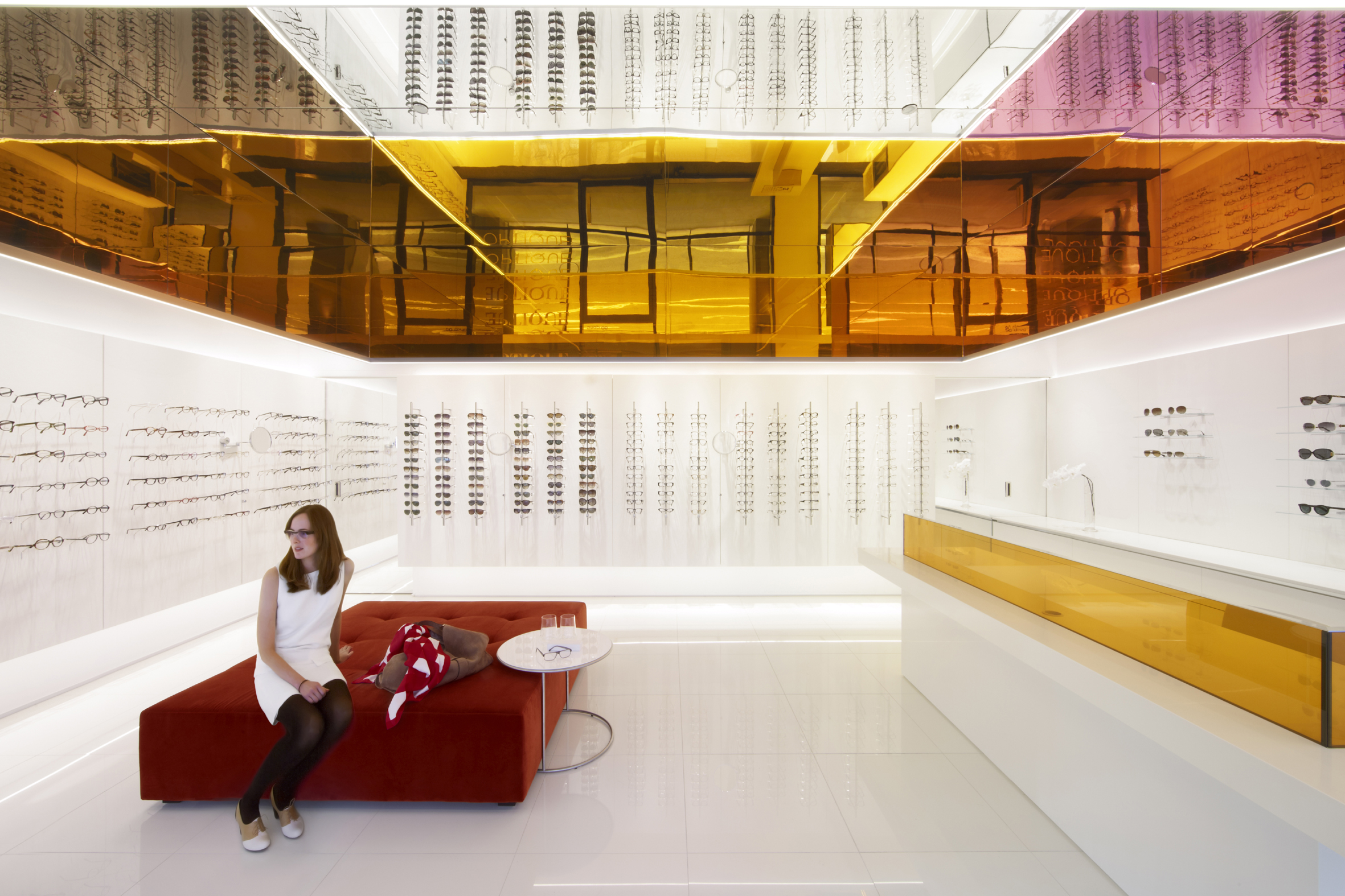
The multi-coloured mirror lantern is the central feature and is illuminated with a narrow ribbon of light to create a complex array of inter-reflected colours and patterns. The effect is captivating and conceptually references what eyewear does; to tint, alter or enhance the image.
The challenge of this project was to visually connect the space to the pedestrians passing by. This challenge was due to the store’s elevated and set back position, at the base of a dark and imposing building. The solution was to turn this challenge into an opportunity; by utilising colour and contrasting levels of light to create a brilliant “jewelry box” at the foot of the building.
The ceiling mounted coloured mirror lantern is illuminated by slim linear bands of light that wrap around the inside of the lantern; the downwards component being visible and directly contributing to the general ambience of the space, with the upward band of light only being seen in the reflections of the coloured mirrors. By day and night the lantern glows bright orange to attract attention to the shop.
Around the exterior of the lantern, deeply recessed LED downlights focus on the frame displays. This is complemented by indirect linear lighting emitted from above and below the display joinery, which provide diffused lighting for the customers. This creates the ideal lighting scenario, where the white leather display panels and the products are beautifully lit and highlighted by the directional lighting, whilst the customers are bathed in a soft and complementary light to make them look and feel good in the space. From most locations, the lantern itself hides the downlights from direct view, ensuring that the customer’s focus is not distracted away from the products.
With its fashionable and modern look, the design marries effortlessly with the optometrist’s branding and business ethos to make it a destination shop for customers to visit.
Details
Optique Optometrists, Potts Point
Credits
- Architect: William Smart, Victoria Judge and Marie Burgess from Smart Design Studio
- Photographer: Sharrin Rees

